Lighting Design
Spring 2018 - John Ore
Visual Design Analysis and Story

Visual Design Elements
- Line
- There is a string diagonal line in this painting with a bright strip coming in from the top left and going towards the girl on the swing
- Every figure(including sculptures) on the painting is looking at the girl which creates implied lines to add emphasis on the girl
- Shape
- A triangle is created between the two men and the girl on the swing, this draws attention to the top of the triangle(the girl) and has the two men as major aspects of the painting
- Mass
- All of the people are about the same size but the girl is in a large flowy dress which increases her size and importance.
- Color
- The girl is dressed in pink which the rest of the painting is green and blue, the pink highlights her and makes her a more important part of the painting.
- The two men are hidden in the shadows and painted darker than many aspects of the painting
- Value
- The value of the girl is much greater than that of any of the other painting being a light pink with the painting being much darker than her.
- Texture
- The texture of the trees are interesting with detail for each leaf in the foreground and a simple texture for the background trees
- The dress on the girl is very flowy and has a much lighter texture than the other elements of the painting.
Visual Story
There is a young women and two men in a small clearing in a forest. She gracefully swings in the center of the portrait in a bright, flowing pink dress. She is being pushed by one man from behind and one watches her from the front. Both of the men are hidden in the shadows as they watch over her.
This group of three has spent the afternoon together on the edge of her family’s home. After some time they find a nice clearing the the woods. Some of her family’s forgotten statues remain in the clearing. They decide to hang a swing on one of the trees in the woods so that she could have some fun. After everything was set up, she climbs on the swing as one of the men push her while the other chose to lie down and relax as the other man helped her swing. She notices him looking up at her and decides to playfully kick her shoe off at him. She wore her greatest dress to impress these two and hopes the dirt of the forest won’t tarnish its beautiful pink color. Show knows that she is beautiful and has these two men interested in her but she must now make the difficult choice between the two. She has been weighed down with the thought that she must make a choice but right now all she can think about is how great of a day it has been and the swing is the perfect way to end it. All that can be heard in the woods is her gentle, playful laughter as she happily swings back and forth. Once she grows tired of the swing, they make it out of the woods and the two men return her home where she must choose who she wishes to be with.
Principles of Visual Design Composition
- Balance
- The painting is fairly symmetrical with the girl on the swing in the center of the painting trees on either side, and two men on the sides of the picture
- It has mostly positive space with trees occupying the majority of the painting filling in what would otherwise be negative space
- Harmony
- It has a very nice harmony, the whole piece uses triangles and lines to create a very calm, complete image
- Proportion
- The girl is slightly larger and therefore closer in the painting compared to the other men at the base of the painting, but the visual elements with the light also highlight the girl, apart from her size.
- Rhythm
- The leaves of the trees follow a rhythm, but apart from that there are not many repeating elements to this painting
- Emphasis
- The girl is heavily emphasised, she is wearing a lighters color than anything else in the painting, the light is directly on her and no one else, there are multiple lines that point directly to her, she is the top of a triangle with the two men. Everything that is done in this painting is done to emphasis the girl.
Natural Lighting Project
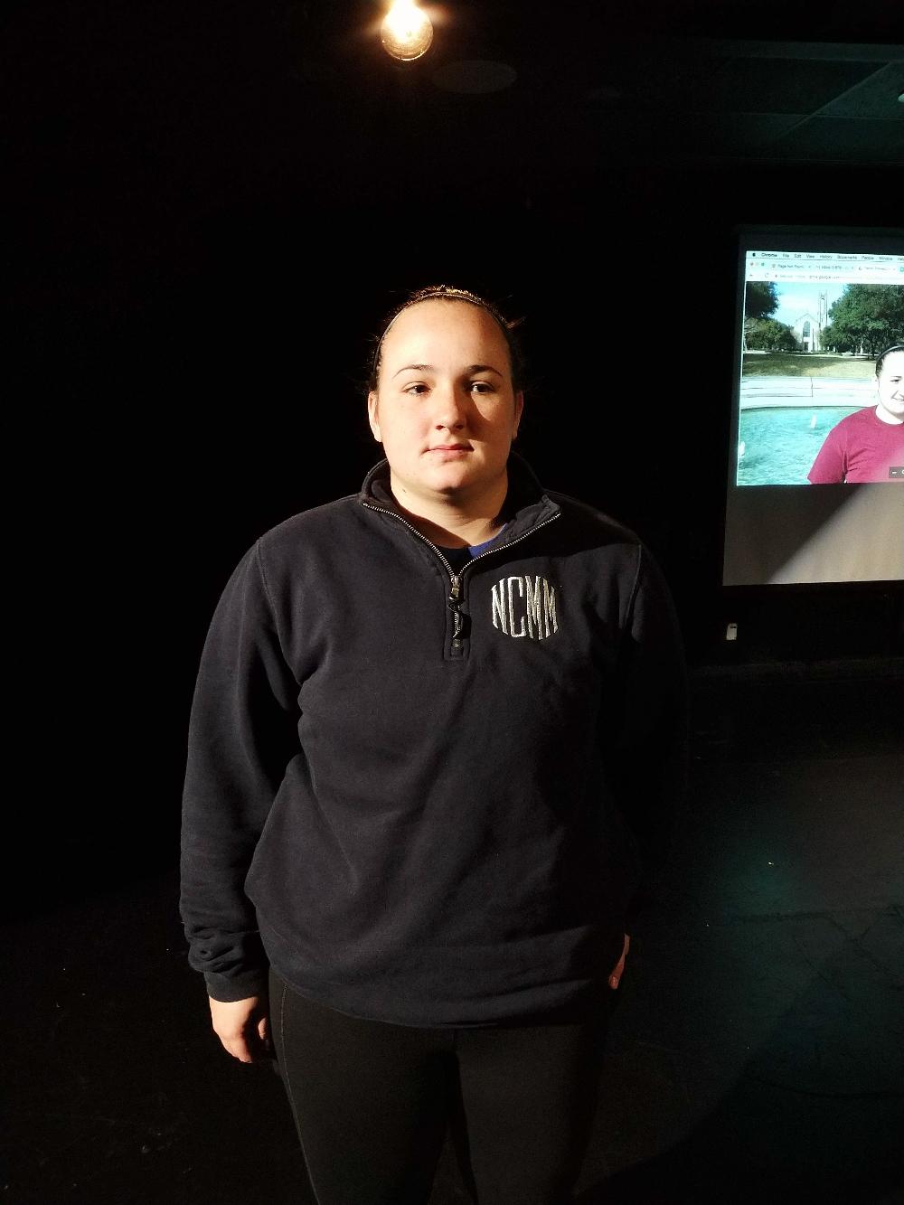
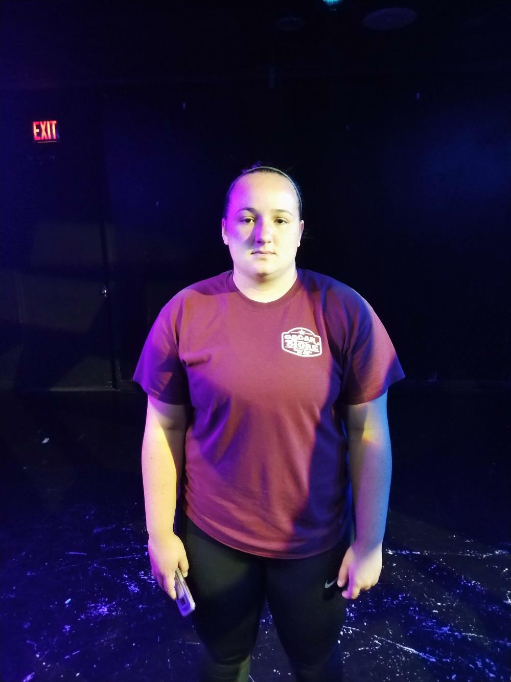
![Recreation in Class]()
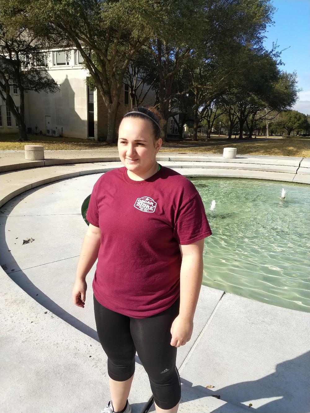
![Reference Image]()


During the observation period, the light was very warm and bright on Nacona’s face. Shadows were very sharp with ambient light coming from the sky and bouncing off the sidewalk. As we were outside, I could slowly see the shadows start to get longer but not much changed in the 20 minutes we were outside. Half of her neck was covered with a deep shadow and the top of her head was lit by the sun and warm.
During the process of making the cue, it was important to us that the color and intensity matched as close as possible. We spent an hour in the black box trying different combinations of gel and intensity. We were able to get the shadows look right almost right away by using only channel 1, 3, and 8. The intensity of channel 1 was 45, channel 3 was 100, and channel 8 was 30. Channel 3 was acting as the sun so that it would cast the shadows properly, channel 1 and 8 were both ambient light sources from the reflection in the sky and backlighting on the top of our head. Finding gel color combinations that worked best was the most difficult part of the assignment. We went through multiple gel in the three lights to try to see what would work the closest to our outside image. After a while, we found that a L203 in 1 and 3 and a L206 in 8 was very close to the original image that we were trying to create. Nothing that we found fit the image perfectly with some of the combinations being too blue, too amber, or too green. We thought that the combination we found was the one that most closely resembled our original image.
During our class presentation, the class thought that our lighting was too orange and we changed the gel in channel 3 to a L202 and that cooled it to look more like the image. Strangely in the images that I took with my phone, the photo before class looks cooler than the picture after class but I do not know why that would be the case because the only thing changed between the two images was the gel in channel 3 which is now a cooler gel than the L203. I do think that in the images that I have, the one after the class evaluation more closely matches the images from the outdoor photographs. However, after seeing Nacona in outside and in the stage light in person, I think that the original cue more closely matches what I could see. When we were creating the cue in the black box, I think that I compared it to the image “photo reference 3” but in class I used “photo reference 1,” the third image seems to have a different exposure and has a slightly different look than the image I used in class and has a closer resemblance to the image before class. The slight adjustments were nothing major and we were still able to get the shadows correct before our class presentation.
Kiara Morales and her partner, that I unfortunately did not catch the name of, had 9 in the morning. Kiara originally did not use much gel in her cue and the outcome was far too amber. The morning sun had many more colors in it that were not in her recreation. After the class viewed, they decided that it needed more blue and she put in a 203 in channel 3 which helped a lot and made the cue look a lot more like her reference image. She was able to get the shadows right in her original cue so she did not have to change any of the intensity of the lights that she used. She used backlights with a L203 on the left and right and a L218 in the middle back which helped keep the cue cool like the reference image. After adding the color corrective gel, the cue looked much more like the original image and looked more natural.
Kiara’s partner had a different cue than she did and had L202 in every light around her which looked almost exactly like the original image. Although they had the same time of day, they took their picture on different days and Kiara had a sunny day while her partner had an overcast one so the shadows were different for the two cues. The low intensity of the lights and every light having a L202 gel made it look as close to the image as she could probably get.
Emily Scott and Chelsea Banawis had 5pm and they each had their own separate cues like the 9am group. Emily’s original cue was too blue using several L202s and L201s and the cue had too much intensity with the saturated colors. After Emily reduced the intensity of several of the lights, it was a much closer match to the reference image. The day that they took their pictures was overcast so there were not many shadows and Emily used all of the lights to reduce any shadows as much as possible. Chelsea had a different cue than Emily that was much warmer but matched the image closer than Emily’s original cue. Her cue looked a little warmer than the image too me but it was very close and looked almost exactly like the image that they took. Chelsea also used all of the lights to reduce the shadows as much as possible.
I learned from this project through my own experience with trying different intensities and gel to create the proper look and the process that other people went through and seeing their outcome on stage. It is difficult to get the stage light to look exactly like the outside, but with trial and error, it can eventually be close.
Macbeth Lighting Design Project
Video to the right shows the lighting effect made for the scene design. The scene took place outside the castle with the witches on a dark and stormy night.
Concept
To highlight the theatricalness of the witch scene with non-realistic colors and flashing lights that highlight the creepiness of the witches.


